GMB Fitness
UX/UI Engineer
Prototyped new landing page backed by user testing
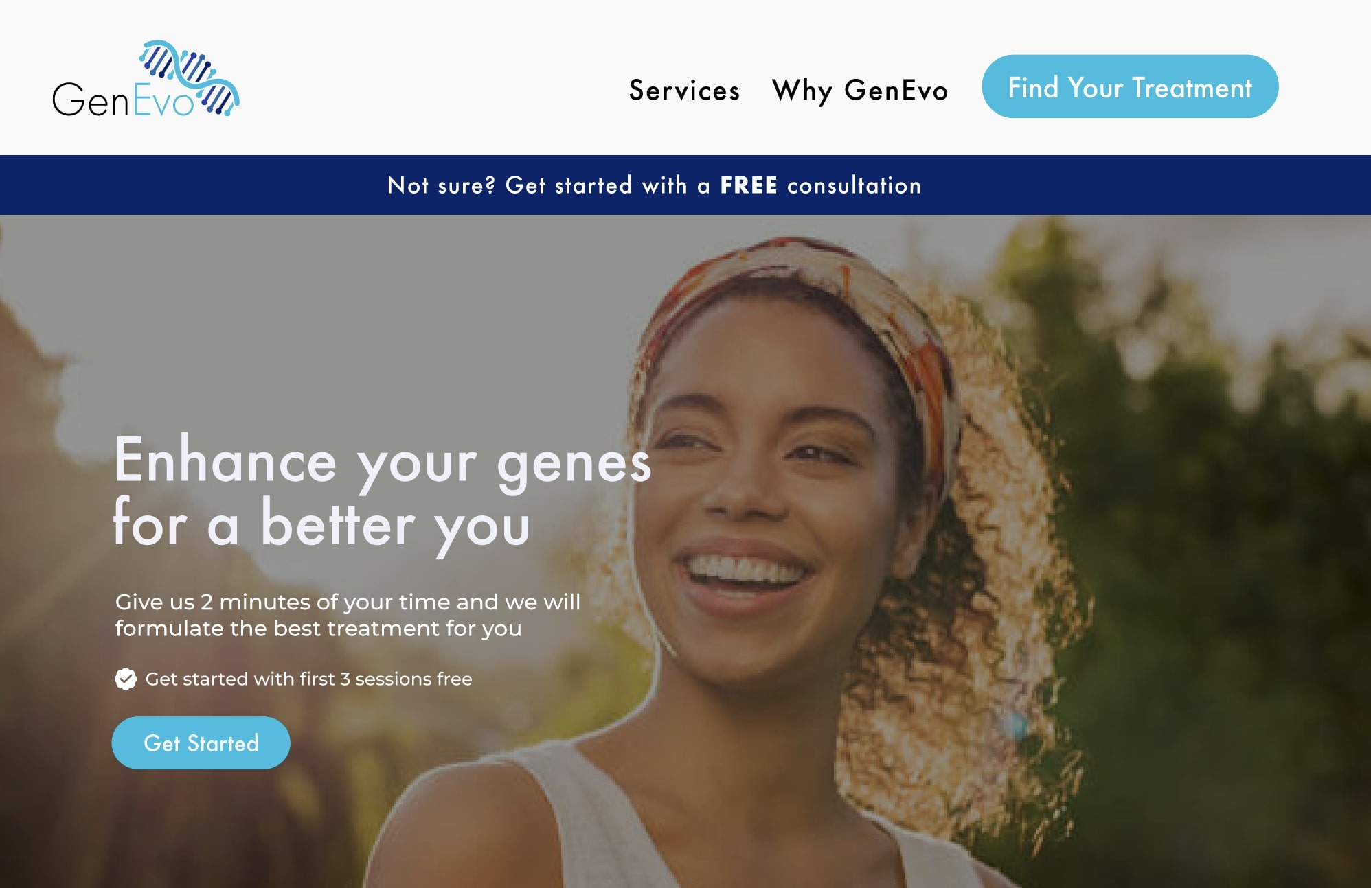
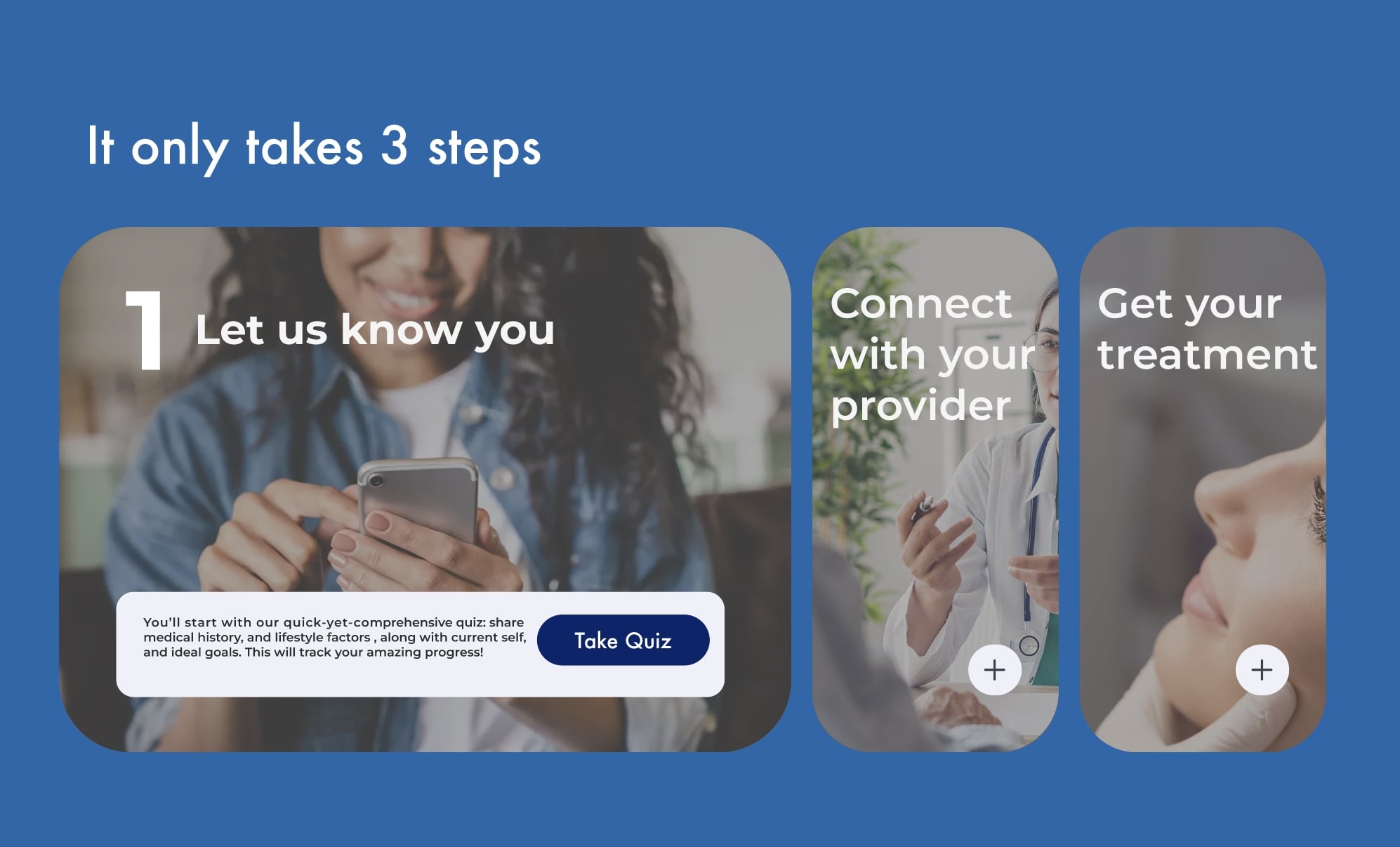
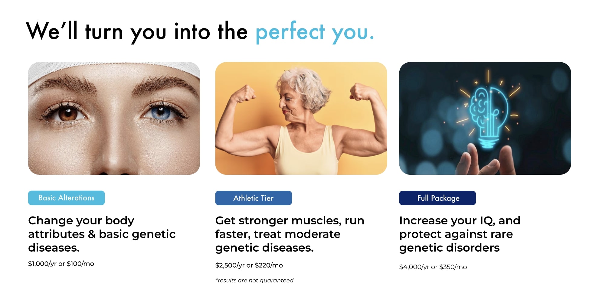
GenEvo Innovations is a company revolutionizing gene editing for human health and longevity. GenEvo has two divisions: GenEvo Therapeutics, focusing on consumer solutions, and GenEvo Technologies, serving enterprise needs. GenEvo Therapeutics stores customer gene data on GenEvo Technologies' servers. To support a new US homeland security contract, GenEvo Technologies will use this data to accelerate research through Evo+, a new service offering gene-editing for performance enhancement.
Age: 25-50 years old
Interests
Age: 25-50 years old
Interests
We aim to target health-conscious individuals who are constantly seeking ways to optimize their well-being. Genetic insights can provide personalized recommendations that go beyond general health advice. GenEvo’s plans highlight preventive care opportunities, empowering these users to make proactive health choices that support long-term wellness.
For those with a family history of genetic conditions, our website offers valuable insights into potential hereditary risks. Additionally, GenEvo can suggest preventive measures and monitoring strategies tailored to their needs, providing peace of mind and opportunities for early intervention.
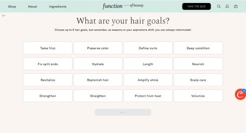
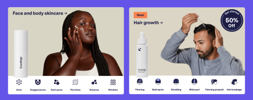
By researching competitors and companies in similar markets, we identified what made them successful. We were particularly intrigued by the formula-finding systems used by Curology and Function of Beauty. This inspired us to implement a similar feature in GenEvo's sign-up process, allowing the platform to gather specific genetic data directly from users during registration.

This was our user flow to get them to sign up for their consultation and provide us with their genetic data. It involved a step-by-step process that would be user-friendly and easy for the users to navigate. We wanted to integrate this user flow with a quiz-like UI that our competitors were using. By spreading out the options and lessening the cognitive load through progressive disclosure , we hoped that users would be more inclined to finish the quiz and provide us with their genetic information.
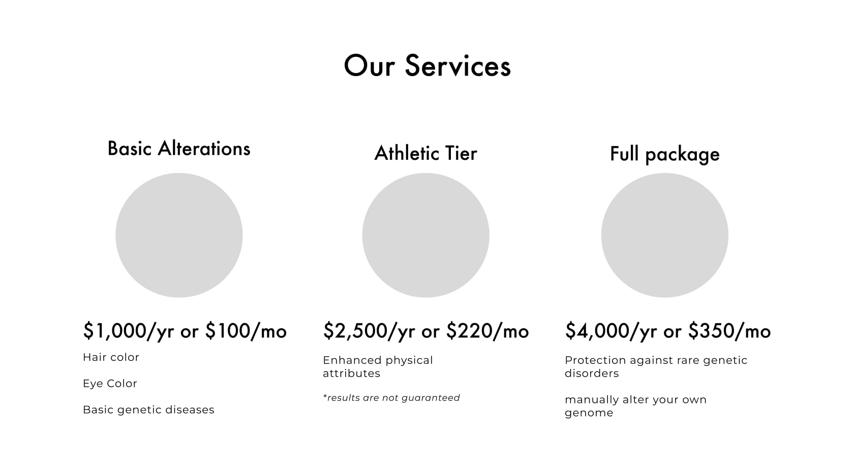
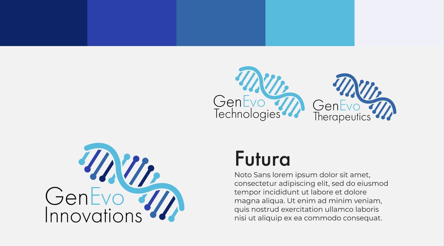
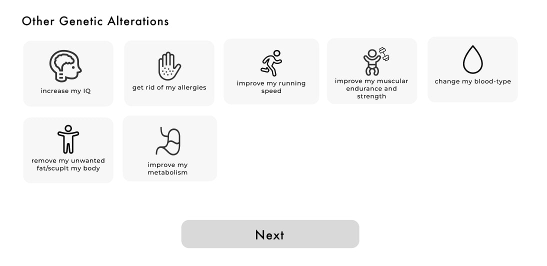
Using the brand guidelines that GenEvo had presented to us, we started prototyping. Each one of our team members had a different style of design and prototyping, so we discussed which elements of our prototype that we all enjoyed and combined them into one. We agreed upon the usage of symbols to convey our quiz options in a user-friendly manner.
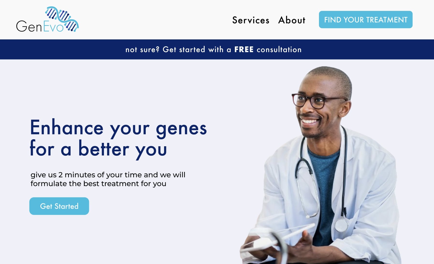
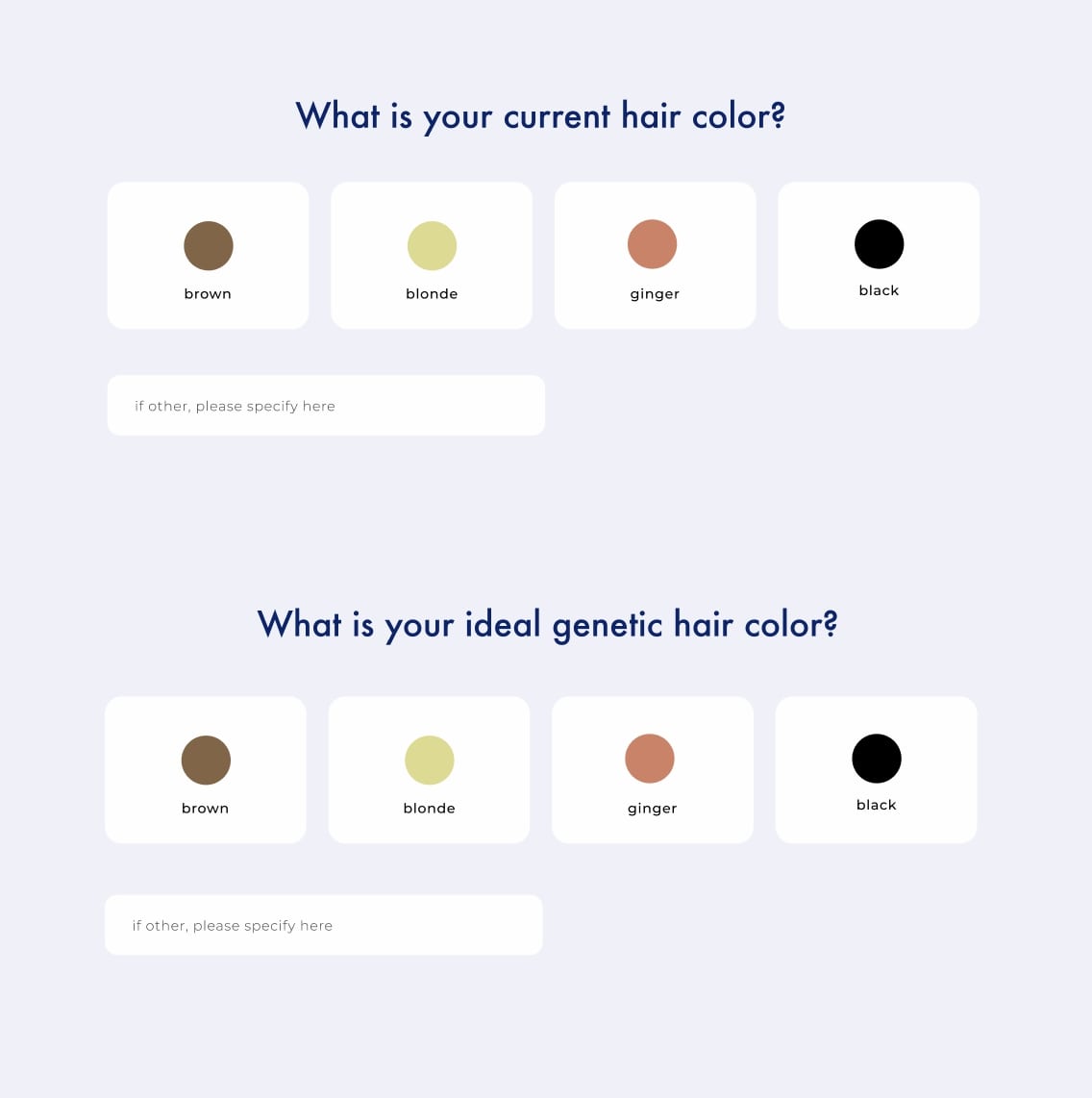
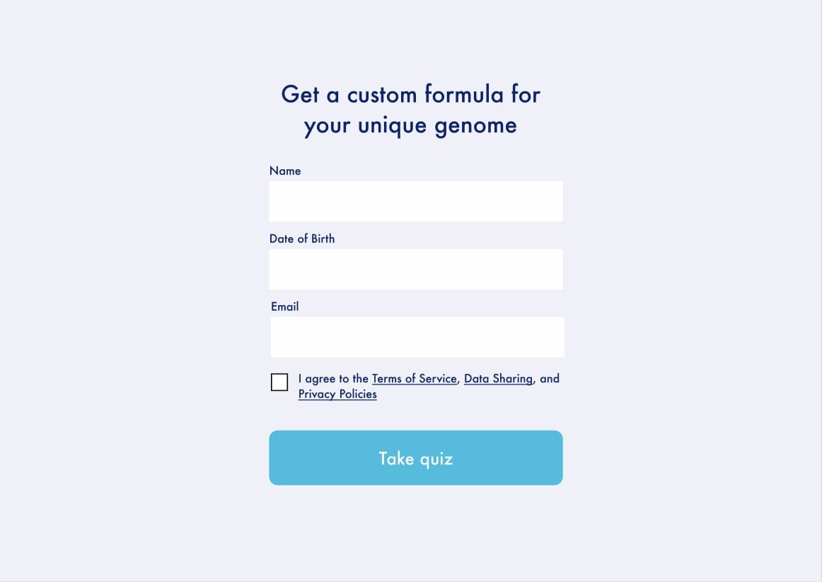
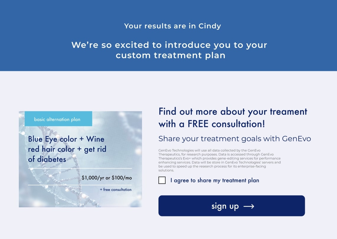
Building on the collaborative ideas from our low-fidelity prototype, we refined the design to produce a polished high-fidelity prototype. In this version, we incorporated the brand’s color scheme, typography, and visual style more cohesively, ensuring alignment with GenEvo's brand guidelines. Interactive elements were enhanced to improve usability, with consistent visual feedback and smooth transitions that guide the user experience. We also refined the quiz options, using well-defined symbols paired with clear labels, making it more intuitive and visually appealing. This high-fidelity prototype captures a realistic look and feel, bringing our envisioned user journey closer to a finished product.
These were the questions that we asked our potential users. Each individual team member interviewed five candidates for a total of 20 interviews. Here are the quantifiable results.
85%
of users inputted their emails and name
60%
felt comfortable about data they were sharing
4
users wanted more context about data sharing
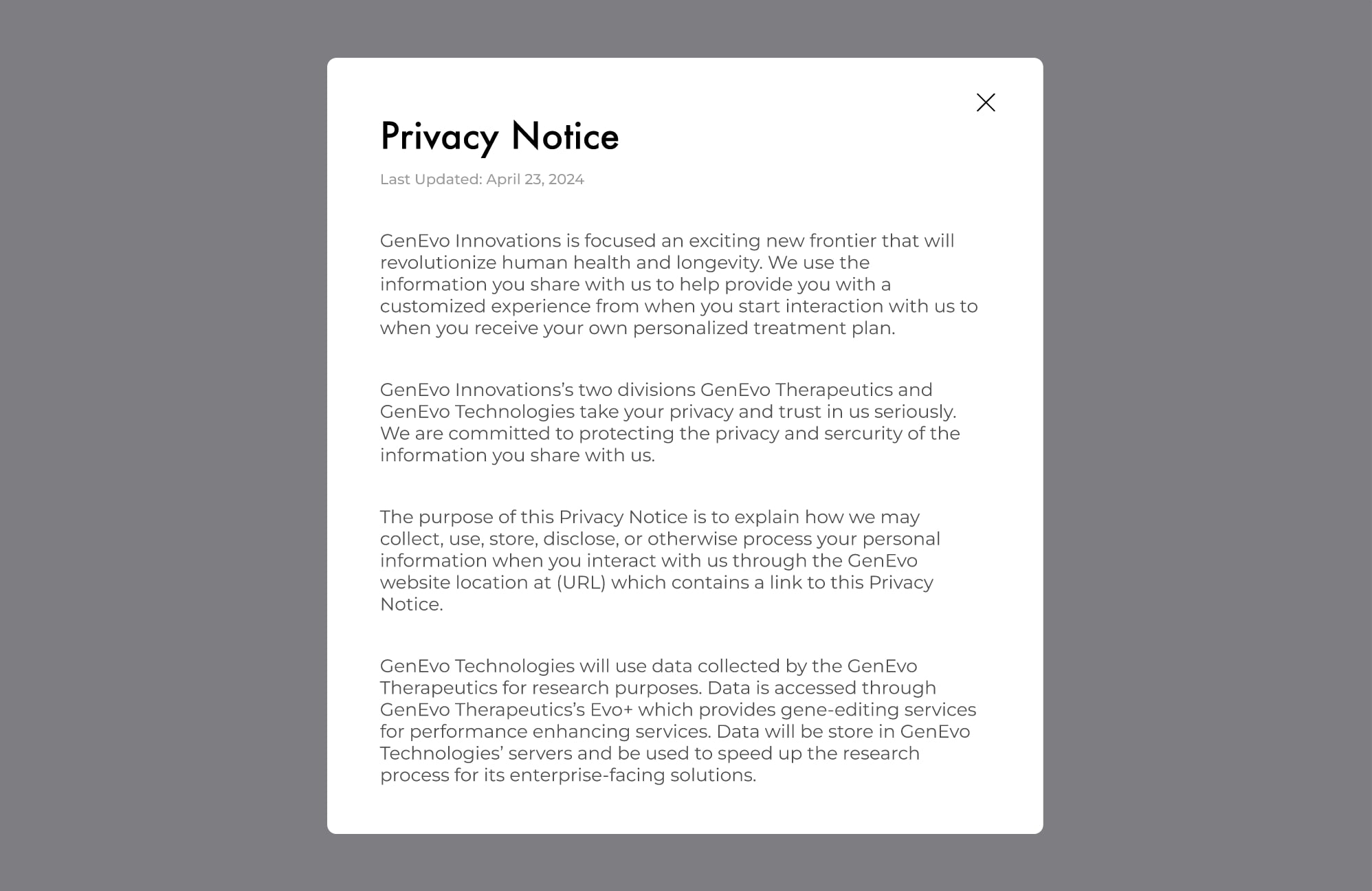
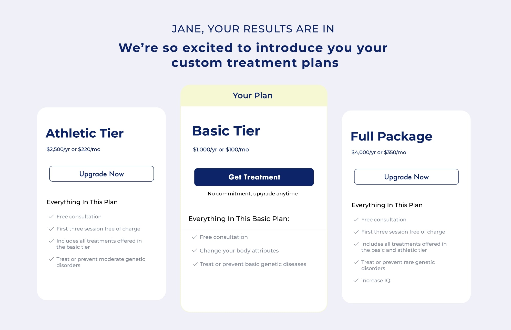

Based on the feedback we received, we iterated our prototype to address our users concerns and implement some of the features that were presented. We added more steps to the quiz so our users felt less overwhelmed. We changed the wording on the landing page. We also changed the hero image to a more friendlier one. We made the privacy notice more explicit and added a proper modal to display the text. We added an up-selling feature that allowed users to view other options for purchase.
Through this project, I learned the critical importance of collaboration and communication when working with a team. Initially, we faced challenges in choosing a design strategy, as each team member brought unique perspectives and preferences to the table. However, we navigated these differences by accommodating each other's ideas, openly discussing our approaches, and reasoning through which options would best meet our project goals. This process of working through conflicting viewpoints not only led us to stronger design decisions but also taught me the value of flexibility and constructive dialogue in a collaborative setting.
Effective communication was essential to coordinating our timelines and setting up regular meetings, allowing us to make steady progress. Iteration became a crucial part of our process—it allowed us to test and validate our design choices while addressing accessibility and usability issues early on. This iterative approach ultimately saved time and resources and gave us confidence in the effectiveness of our final solution.
The next step will be creating a mobile-responsive version of the design. It’s essential that everything designed for the web functions seamlessly across all devices and browsers. Additionally, we’ll focus on a smooth handoff to the development team. This includes gathering and organizing all assets, as well as documenting precise margin, padding, and layout dimensions to ensure accurate implementation.
Comments