GenEvo
UX/UI Designer
A case study on gene editing company
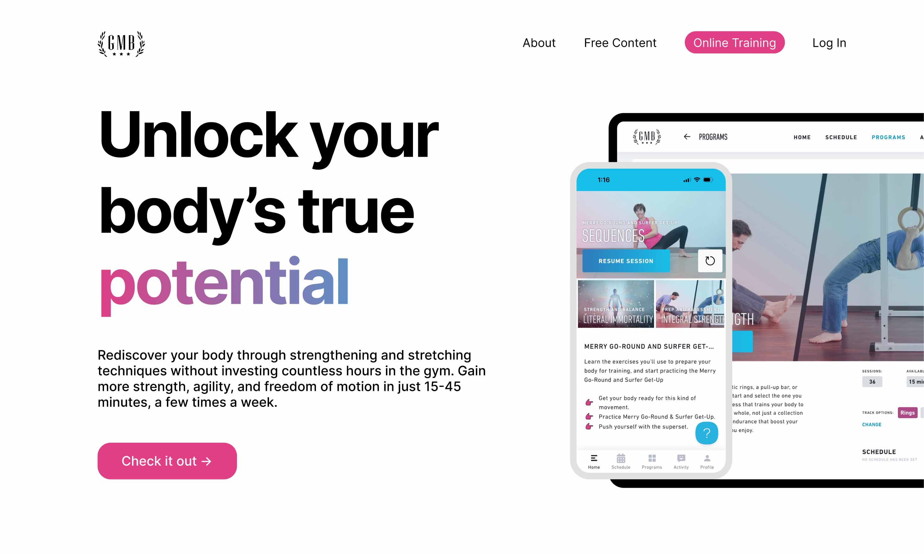
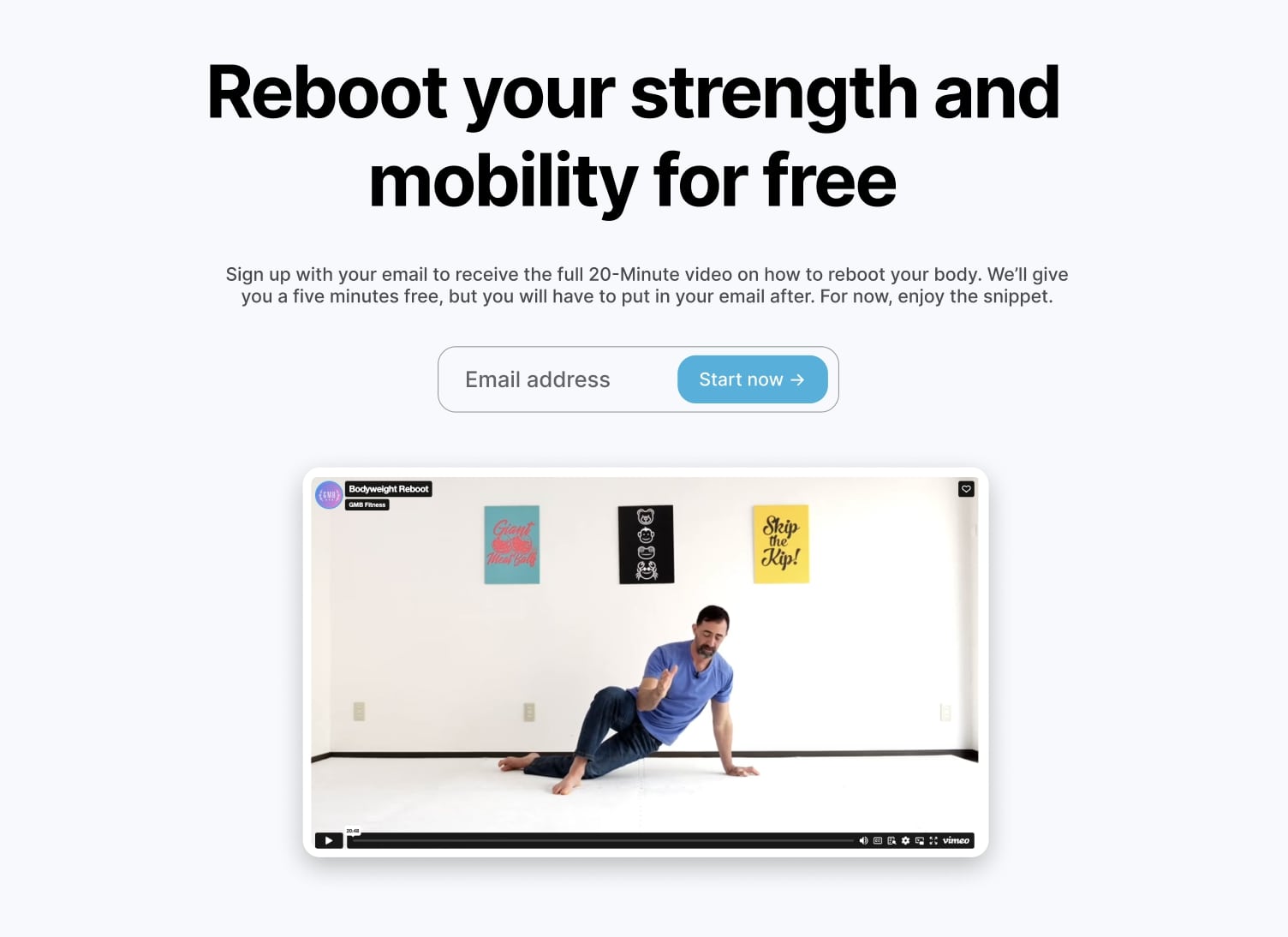
After conducting a site audit and observing potential users navigate the site, I identified these pain points. For the redesign, I aimed to streamline the text and emphasize key areas that highlight GMB Fitness's value proposition. I focused on expanding GMB's brand aesthetics, incorporating gradients, pink, and blue tones. My goal was to create a design that allows users to navigate the site more naturally, avoiding confusion, while instilling trust the moment they land on the page.
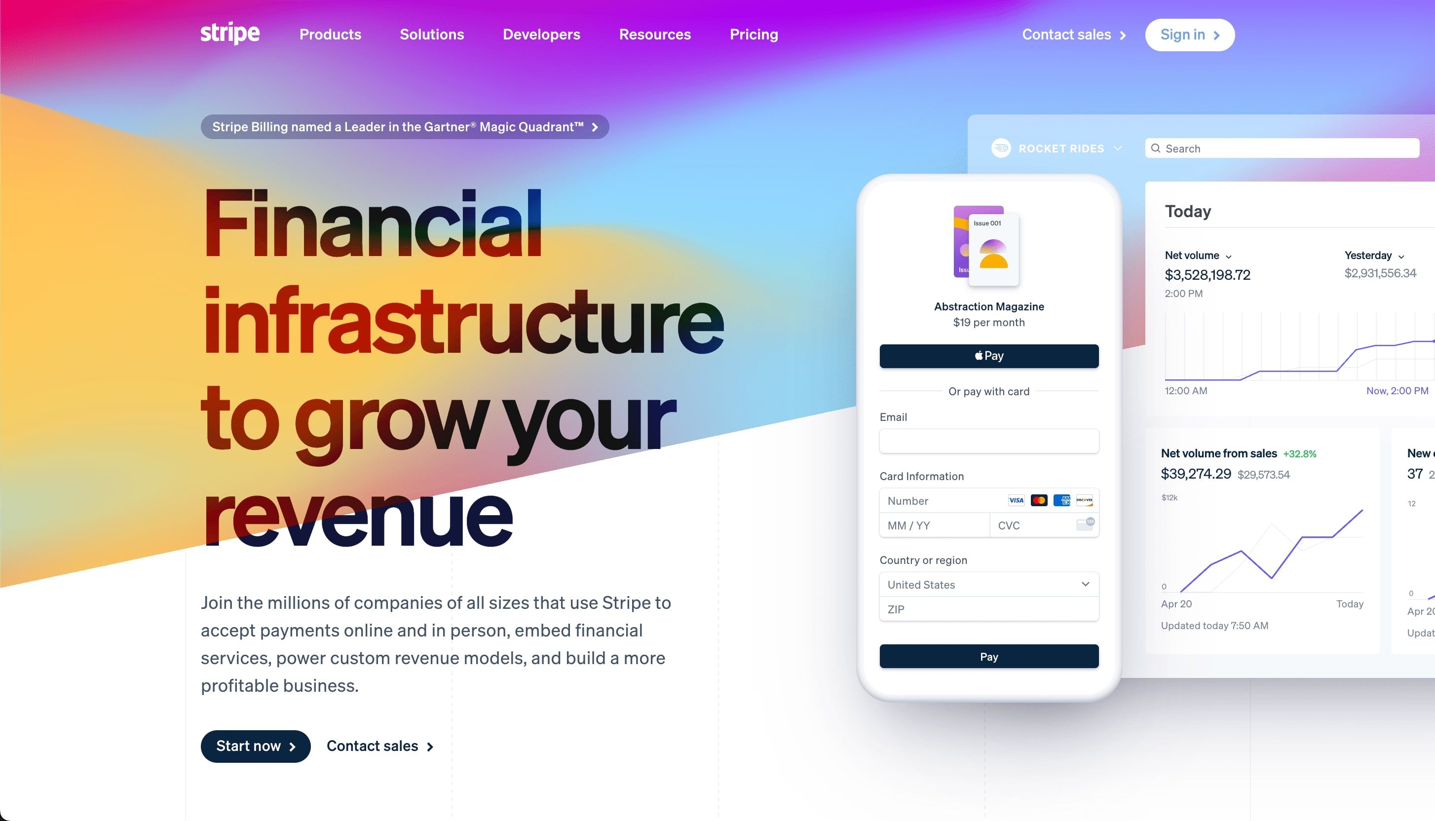
One company that effectively uses gradients is Stripe, whose clean UI enhances their professional appearance. Rather than using gradient overlays on images, I planned to apply gradients to text and backgrounds for a more aesthetic and cleaner look. I also drew inspiration from Ramp’s video carousel layout, which I saw as a perfect fit for GMB’s design. Both Stripe and Ramp make their value propositions easy to grasp at a glance, a goal I aimed to replicate by emphasizing GMB's unique brand appeal and improving its overall aesthetic.
Trent
35-65 years old
Carol
35-65 years old
Through user research and personas, we identified that many of our users are former athletes or active individuals who want to move again but may feel held back by aches and pains. GMB is designed to be a friendly, approachable guide that helps them start moving without the pressure of a complete fitness overhaul. Users don’t need warnings about the dangers of inactivity or unnecessary text explaining how they NEED to move—they’d rather know how just 15 minutes a day can revamp their body. They need a friendly, easy-to-navigate UI to understand and trust what GMB offers.
To clearly differentiate GMB from traditional fitness programs, I strategically planned to place a dedicated section right beneath the hero banner that explains how GMB programs work. I planned to replace the current thin headings with clear, descriptive ones that guide users seamlessly through the content, making it easier for them to quickly grasp what GMB offers. Additionally, I wanted emphasized GMB’s global reach, showcasing the number of clients and countries we’ve expanded to. This not only builds trust but also reinforces GMB’s credibility by demonstrating that it’s a proven product enjoyed by many across the world.
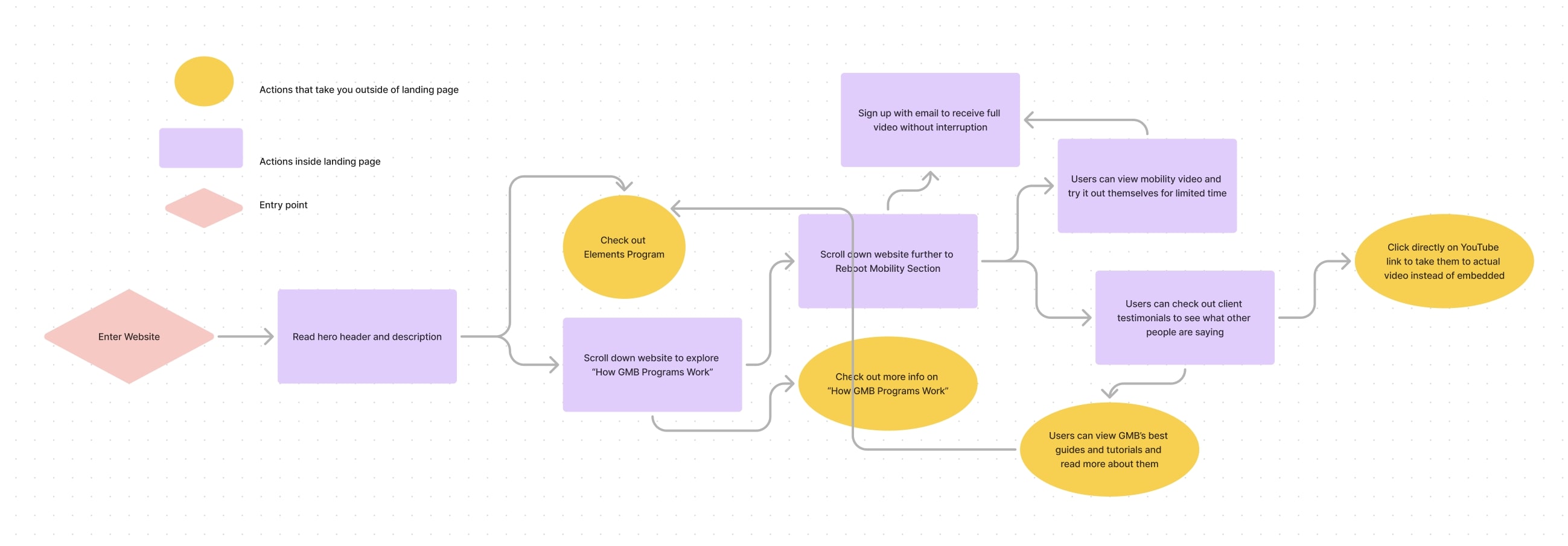
Users should be able to understand what GMB offers within the first 30 seconds of landing on the page. After grasping the core value, they can explore client success stories, showcasing real people who have benefited from GMB's programs, which helps build trust. From there, users can either browse the ‘Best Tutorials and Guides’ or visit the ‘Elements’ page for pricing and detailed information about the programs.
An alternative flow allows users to learn more about GMB’s offerings and what sets it apart, followed by testing the 20-Minute Reboot video. After a set amount of time, the video prompts users to sign up with their email to continue watching, encouraging email capture while offering a preview of the program.
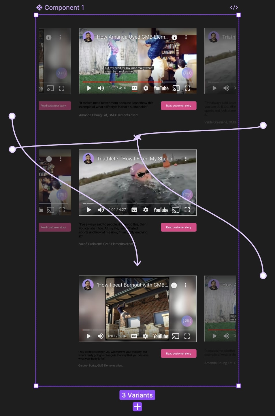

I aimed to build trust in our science-based approach by giving users immediate value upfront. That’s why I included a snippet of our free 20-minute bodyweight reboot video directly on the page. Users can watch the first five minutes to experience the quality of our content firsthand before being prompted to input their email to access the full video. This approach not only provides tangible value but also encourages users to engage further by signing up, creating a natural progression toward conversion. In the old design, users would have to sign up with their email before they received the free video, which could have deterred people from the start.
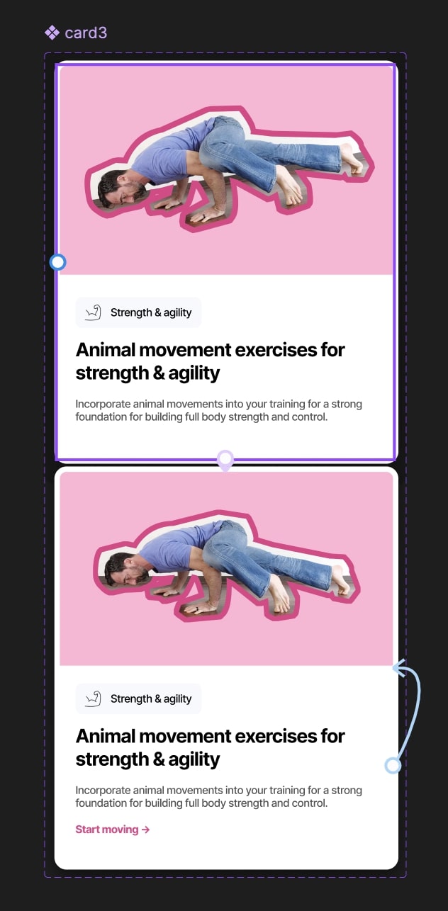
In my redesign, I focused on improving the presentation of our best guides and tutorials. While the original design included these resources, it lacked an inviting and visually appealing layout, which made it harder for users to engage with the content.
In the new design, I prioritized creating a more welcoming and visually stimulating experience. By utilizing simple icons, adding clear headings, and incorporating inviting imagery and visuals, I made the guides more accessible and engaging. This redesign allows users to explore the tutorials more easily, ultimately creating trust in the quality of our offerings and encouraging deeper engagement.
The improved design helps users feel more comfortable and interested, contributing to higher retention and interaction rates with our content, and positioning them closer to making a purchase.
After performing some usability tests with my prototype, I had some design feedback that included:
Based on the feedback, I made some adjustments to the prototype and presented it to the tech lead for approval. He approved the design, so I will now move forward with the development. Instead of migrating everything to the new design all at once, which would be a significant brand shift, I plan to implement the improvements gradually, updating the website component by component. I will use PHP, HTML, SCSS, and JavaScript to implement these designs.